

Ever wondered how a realistic tree trunk comes to life on paper? In this step-by-step blog, I’ll show you my full drawing process — from the initial sketch (traced for accuracy) to the final detailed result. Using pastel pencils, I take you through each phase with photos and explanations. No shortcuts, just a bit of pastel magic!

Step 0 – Transferring the Reference Photo
Before any color hits the paper, I start by carefully transferring the outline of my reference photo. This step helps me get the proportions right without wasting time sketching freehand. I trace the main lines onto the pastel paper — just enough to guide me through the drawing process without overwhelming the final result.
📷 A strong start begins with solid structure!

Step 1 – Blocking in the Darkest Areas
Every drawing has to start somewhere – and mine begins with the dark patches. I don’t focus on the details just yet. Instead, I follow the lines I’ve carefully transferred on to the paper and begin by blocking in the darkest parts. These shadowy shapes form the foundation of depth and contrast in the final piece. It's all about creating a strong structure before refining anything.
🖤 This is where the magic starts!

Step 2 – Blocking in the Midtones
Now that the darkest areas are in, I move on to the midtones. At this stage, I’m still not blending or layering — just placing flat patches of medium colors next to the darks. This helps me see the overall structure and balance of the drawing without getting caught up in details. It’s like mapping out the bones before adding muscle.
🌳 The tree trunk is starting to take shape!

Step 3 – Placing the Lightest Colors
With the darks and midtones blocked in, it’s time to add the lightest colors. Just like before, I’m not layering or blending yet — I simply fill in the lightest areas with flat patches of soft tones. These highlights will later bring contrast and realism, but for now, they help define the light direction and overall composition.
✨ It may look rough, but the foundation is almost complete!

Step 4 – Gentle Blending
Now it’s time for some very light blending. I don’t want to overdo it — just enough to soften the rough patches and let the paper texture fade into the background. The goal is to unify the colors without losing their individual character. If I blend too much, it all turns into mud. If I blend just right, the drawing starts to glow.
🖌️ Soft touch, strong impact.

Step 5 – Discovering Hidden Colors
Now it’s time to really look. With the base in place, I take a closer look at the reference photo and start noticing subtle colors I missed before — hints of green, soft purples, and other tones hiding in the bark. I add these roughly, without overthinking, just responding to what I see. These unexpected colors add richness and depth to the piece.
🌈 Nature is never just brown and grey!

Step 6 – Refreshing the Colors
After blending, some of the colors looked a bit dull — that’s normal. So in this step, I go back in and reapply the main colors. I still don’t focus on details; I simply follow the color flow I see in the reference photo. This refresh brings back the contrast and richness that blending can sometimes soften. It's all about keeping the vibrancy alive!
🎨 Just trusting the colors, not the details.
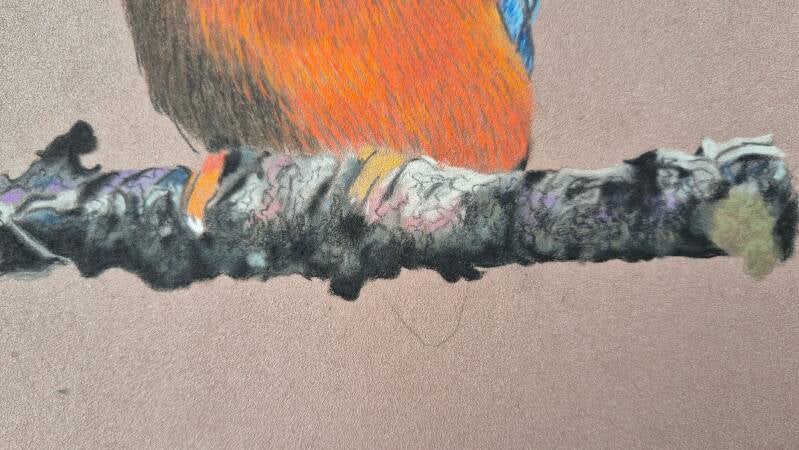
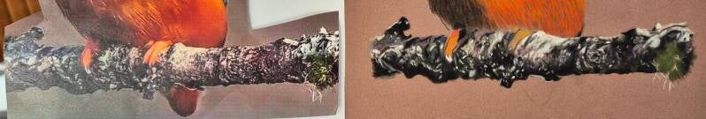
Step 7 – Adding Texture and Details
Now the fun part begins: texture! I start building it up by going back to the darkest colors first, then layering lighter tones on top. This time, I’m carefully studying my reference photo and trying to capture as many details as possible — the cracks, knots, and subtle shifts in the bark. The drawing finally starts to look real.
Oh, and the close-up photos I’m taking? Let’s just say… they’re not pretty. 😅 When you zoom in this much, everything looks messy — but that’s okay! These shots are meant to show the process, not perfection.
🪵 From flat to full of life, one detail at a time.
Step 8 – The Final Touch
Is it completely photo-realistic? No — and it doesn’t have to be.
The goal was never perfection, but suggestion. I want the viewer to feel the bark, not measure it. No one’s going to hold the photo next to the drawing anyway… and besides, this is the artist’s hand at work. The character, the strokes, the decisions — that’s what makes it art.
🖌️ Realism is the base. Interpretation is the magic.
And that’s the full journey — from a rough sketch to the final textured bark in pastel.
No, it’s not a perfect copy, but it carries the feeling, the colors, and the hand of the artist. That’s what matters most.
✨ Curious to try this yourself? I offer personal pastel workshops where you can learn these techniques step by step — no experience needed.
Visit Workshops for all the info!
With all my love💗
Arty By Esther
Add comment
Comments